What’s a MOGRT?
An explainer video about a confounding file type!
This is a personal project I thought the world needed to explain what the heck a MOGRT really is and why they might be of use.
I went with a simple, high-contrast design aesthetic to mirror the simplicity of using MOGRTs as a video editor. There may be a lot going on under the hood in After Effects, but MOGRTs keep Premiere editors’ hands clean and their heads out of the fray.
Design, Animation, Sound Design, Script / Isaac Sommers
Voice Over / Greg Phelps
Pre-Production
Did you say MOGRT?
I’ve rarely come across something more deserving of an explainer video than MOGRTs. They feel almost intentionally confusing, which is a great problem to solve.
I wrote out a short script, based around four sections: the hook, the question, the answer, and the button.
MOGRTs are pretty abstract.
I quickly realized a literal visualization of a MOGRT would be either a block of code or a circuit board, so I opted to keep things figurative.
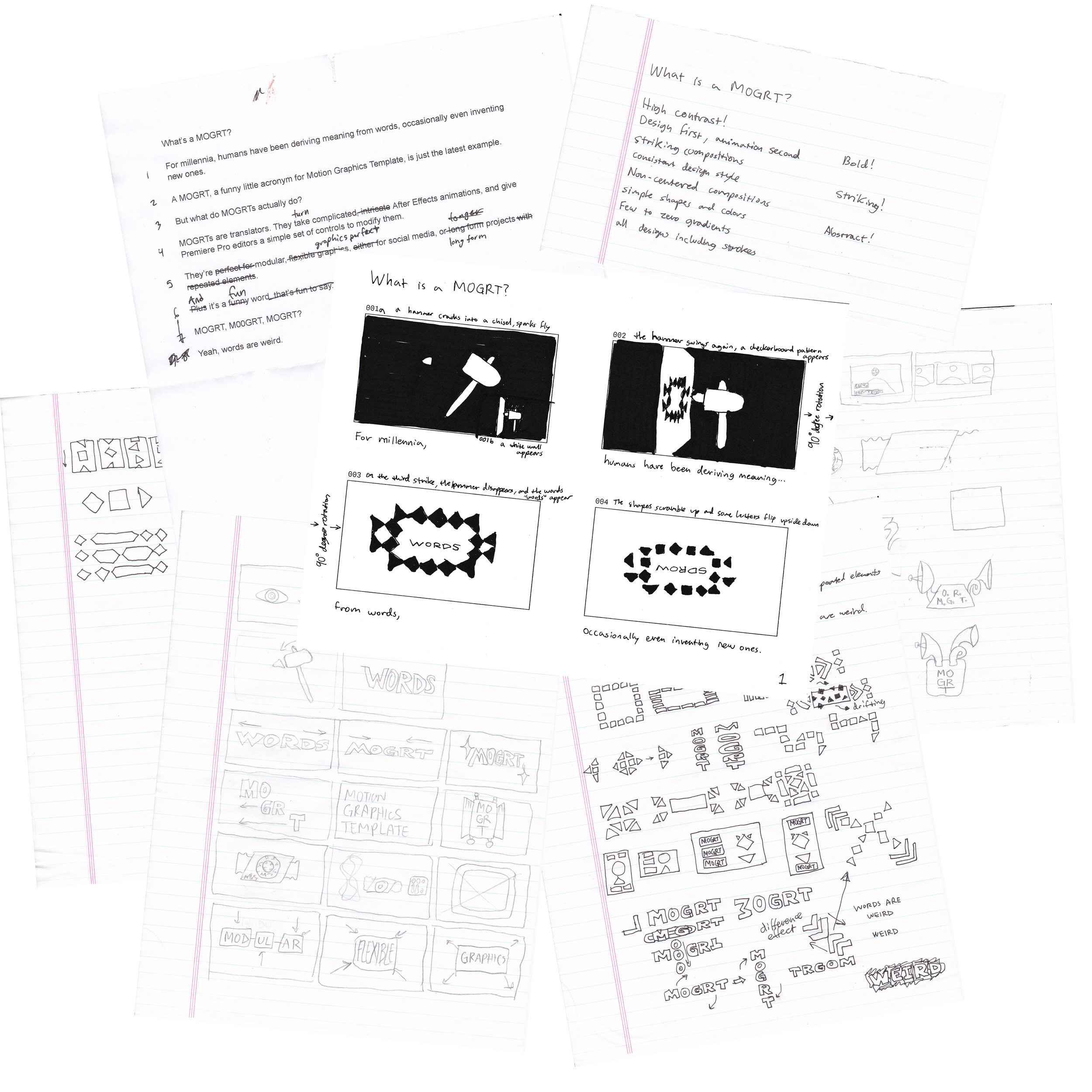
Initially, I envisioned a MOGRT as a cypher, or a sort of decoder of information, with both an input and output. My earliest sketches feature satellite dishes and gramophones, but even those visuals were too literal for my taste.
I first felt like I had something when I sketched out a hammer chiseling “WORDS” into a stone tablet for the intro visual.
To help concretize my initial noodling, I wrote out a quick design guide for how I wanted the video to look. This really helped when designing the MOGRT itself.
Design
Design first, always.
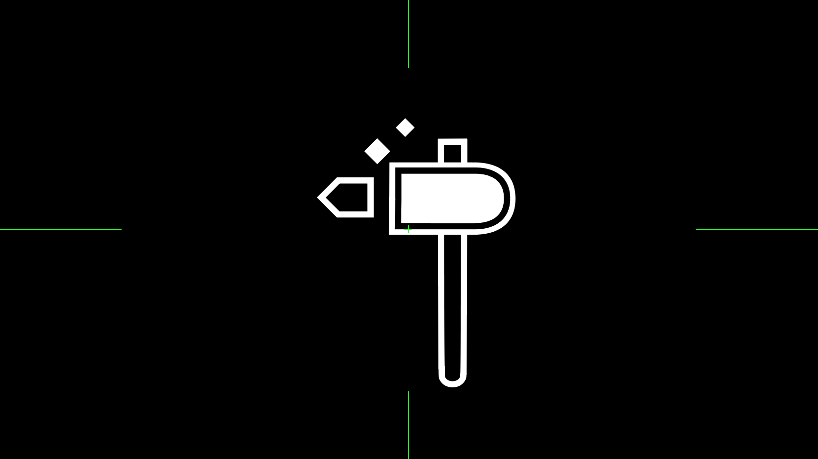
The simple, geometric shapes of the hammer and high-contrast composition felt like a style I could use throughout the video.
I wanted to show After Effects as a cluttered mess of jagged shapes, and Premiere as a smooth, simple interface, so the MOGRT needed to be a blend of both.
After some experimenting, I ended up designing a little MOGRT using right-angle triangles, squares, and circles. The triangles could then twirl open, as if it was flipping out its satellite ears.
Let’s go monochrome.
The decision to keep the video totally black and white evolved naturally out of the pre-production and design process.
I tend to start designing in black and white and then figure out a palette later down the line, but in this case the harsh, high contrast imagery really caught my eye, so I went with it!
Animation
A little 3D goes a long way.
As a primarily 2D After Effects artist, I tend to treat 3D as an extra fragrant spice, and save it for only the most special moments.
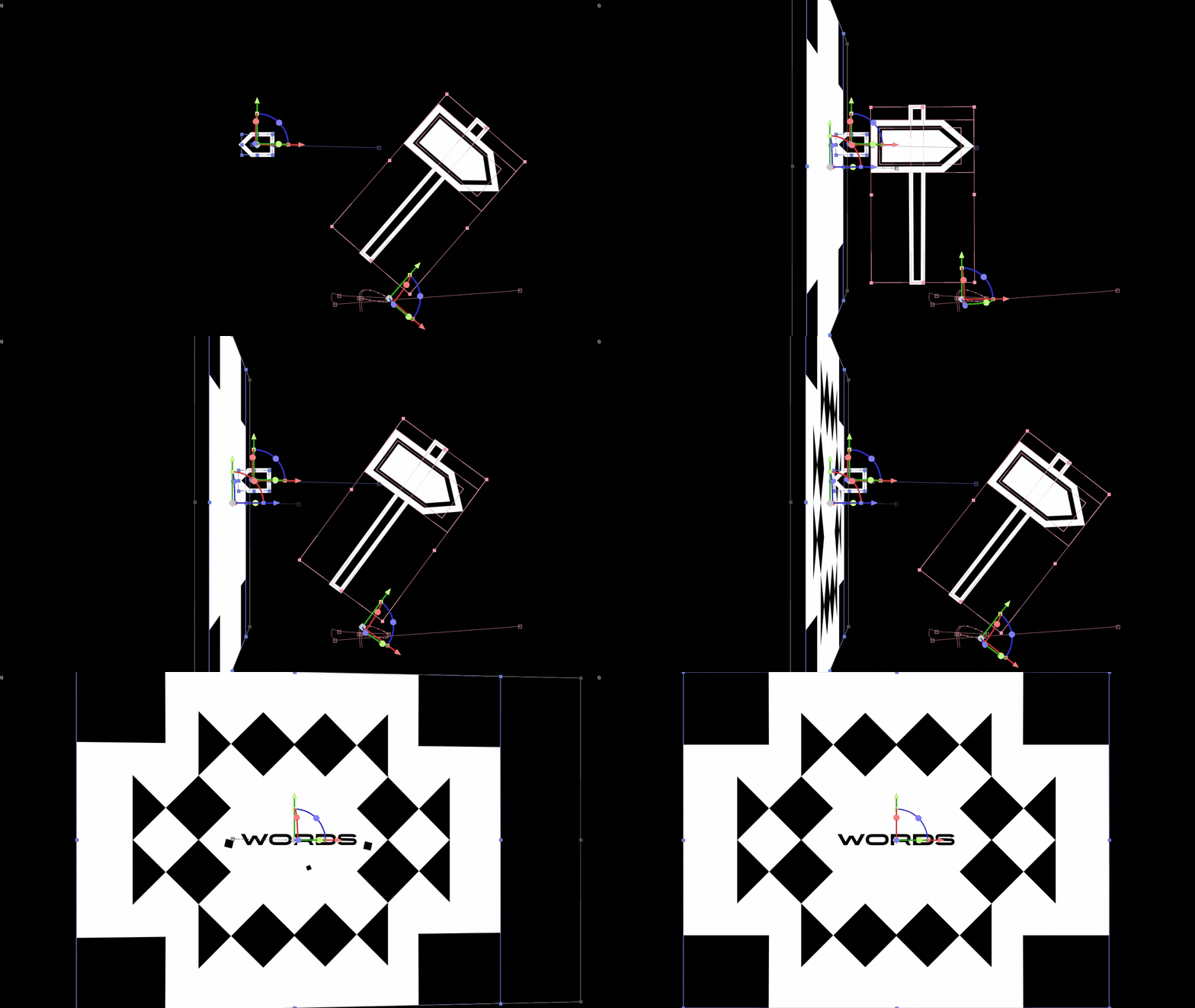
I knew the video’s hook was going to be critical to keep people watching, so I used a 3D camera turn to change perspective mid-shot, resulting in an eye-grabbing flourish.
A font that stretches.
I love variable weight fonts. There, I said it! But getting them to behave in After Effects can be a challenge. Using Overlord, I imported each word at both width extremes, then copied over their path keyframes, thus giving me malleable animated text.
Stylistically, the variable weight font (Organetto-Variable) was the perfect metaphor for MOGRTs. It was flexible, fully able to take on a wide variety of letterforms, while still retaining legibility.
And it really was a joy to animate!
Post-Production &
Sound Design
Sound Design, the perfect distraction.
One day when I was very tired of staring at this project on my computer screen, I decided to do something completely different.
I grabbed a hammer, my little USB microphone, a stack of ceramic pot saucers, and got to work.
I mostly use a small library of stock sounds for the majority of my Motion Design work (including the bulk of the sounds in this video) but I wanted give some Foley a go.
I recorded myself hitting the saucers with a hammer, and then, for good measure, I tried scraping the hammer against the rug.
Turns out, it was the perfect sound for some abstract shapes rotating in space.
No Effects.
At this stage I would typically gussy up the video with some effects (It is called After Effects, after all), but given the simplicity of the design style, I opted to leave it totally clean.
In conclusion.
This project really reminded me how important it is to have a well established creative process.
I was the client in this situation, and it can be easy to get lost in the weeds without any real-world deadlines or deliverables, but by breaking down this video into more manageable chunks, and working on them over time, I was able complete it. Overall, I’m really happy with the final product.


